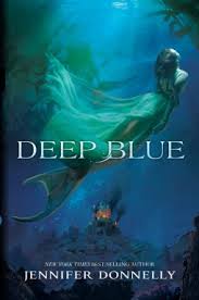
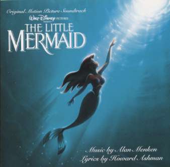
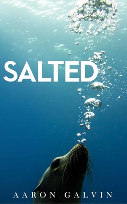
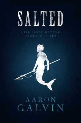
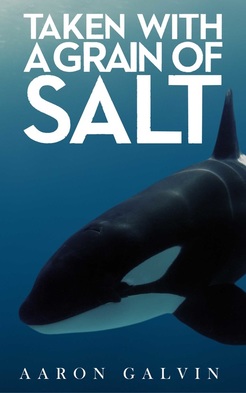
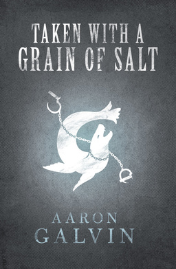
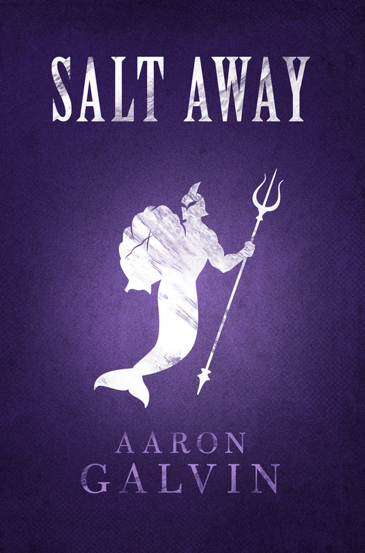
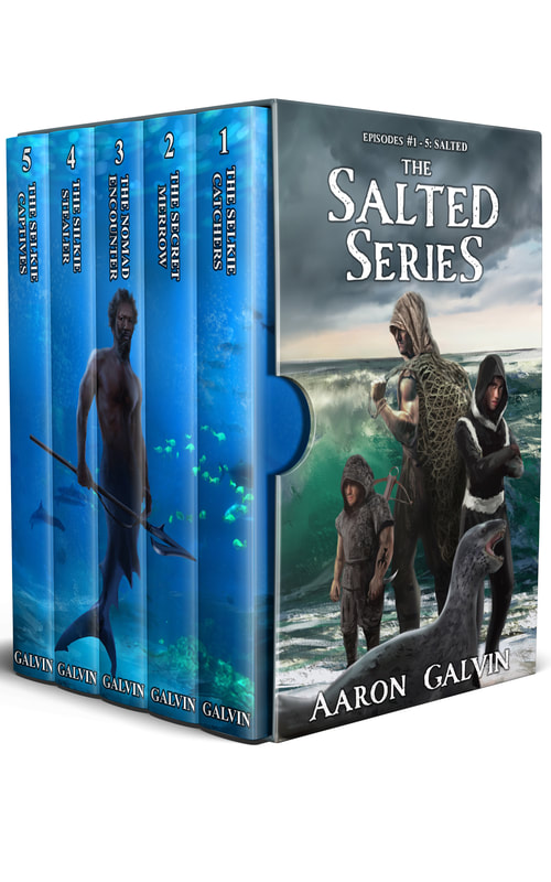
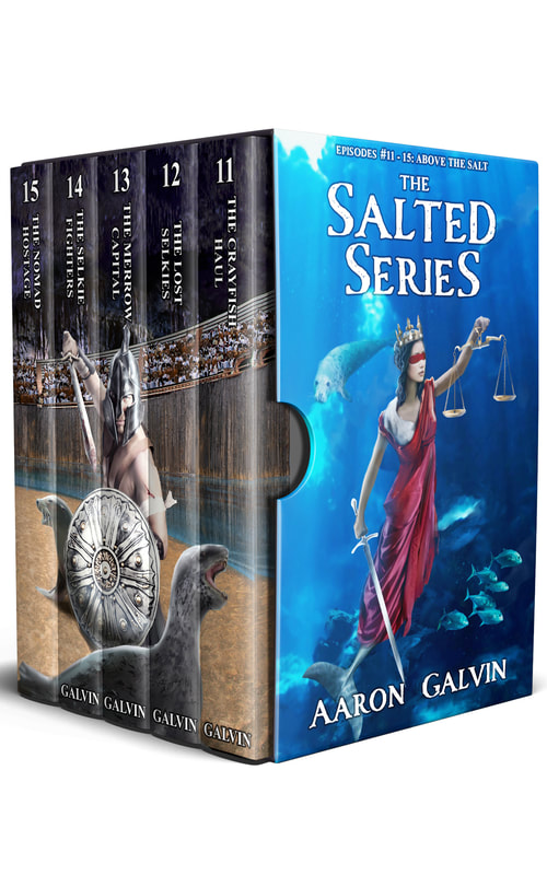
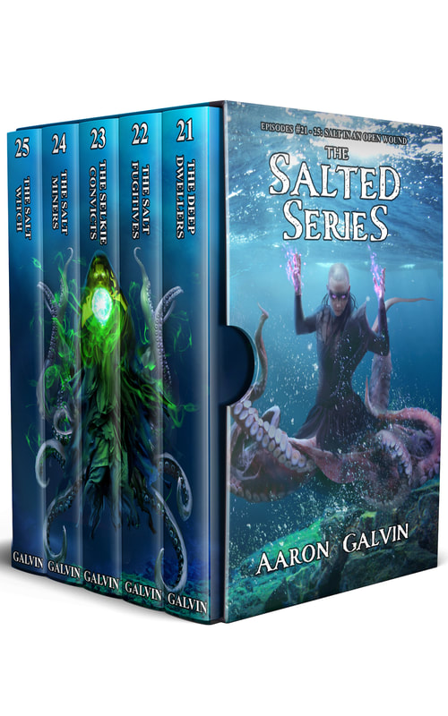
 Thought about titling this post 'Here's What I Learned', but let's face it - in today's society, more people are interested in hearing how someone screwed up than what they actually learned. I'm gonna give you both. Today, you get to see the Rascal admit his errors, multiple failings, and eat some crow. I'll show you how I screwed up my debut novel, Salted, how I doubled down with its sequel, why I've sat on those mistakes for two years. More importantly, I'll go over the changes I've implemented to hopefully succeed in this newest go-around. (Aaron picks up his knife and fork) Hope you enjoy the spread, folks. This is where Aaron Galvin gets real. Before I turned to writing full-time, I worked as a senior management consultant for six years. Basically, I would visit various organizations and meet with their employees, management, and senior leadership to obtain their feedback on what was working or not, and suggestions each group would have for how to improve. These were fantastic experiences for me because, as an outsider, I went in with limited knowledge about the company and left to write my reports with both a broad perspective of the entire organization and also departmental specific strengths and opportunities. In many ways, I liken those experiences to that of a reader - we pick up a book based off its cover, synopsis, or maybe what we've heard from a friend. By the time we're done with the read, we make our own assessments on what worked or didn't. After that, maybe we move onto the next book in the series, or maybe we click on the links to our favorite retailer listed in the right sidebar of Aaron's blog to write a fantastic review to help said author and his books gain more readers. The point is this - as a reader, we come to a new book with little knowledge but hopefully a lot of promise. In the case of my Salted series, I failed in that promise on a couple levels. One thing I'd like to make abundantly clear before I dig into this delicious bit of crow. All the errors, faults, etc. that I claim in this post are exactly that - mine. No decision was made without I signed off on it. We live and learn, right? Let's dig in. Cover Design"Don't judge a book by its cover," said everybody ever. Thing is...we do. I felt like I knew this concept well and, before commissioning the original Salted cover, I spent hours wandering the aisles of Barnes & Noble, studying the YA shelves, then scouring bestseller lists in trying to determine what made a good cover. I read the forums of traditional publishing pros, indie pros, etc. and took their advice to heart. Then I went out and did the exact opposite. Salted was my debut novel, but also my first foray into self-publishing. Like many newbies, I wanted to make a statement. To be different and stand out from the crowd, rather than resemble most of the popular mermaid covers that, to my mind, were variants of the same image. Also, I thought the above covers all skewed towards YA females and romance, while my series is meant to intrigue YA males, featuring action and darker storylines with little/no romance. Beyond that, I felt like Salted featured Selkies - (people who can transform into seals or sea lions) - more prominently than mermaids. I couldn't find many covers featuring Selkies and thought that would be the better way to stand out. My hope was to change the way people looked at marine creatures and that readers might wonder 'what if' the next time they saw a seal or sea lion at the zoo, beach, or ocean. Thus, I added a couple things to my checklist: 1) Realism, and 2) A Selkie. *** Item 3 on my list of needs was quality. Now, I realize by definition that 'quality' is in the eye of the beholder, so that's a tough one to nail down, but I took the mindset that I would be competing against the big boys of NYC publishing so I needed a product to match reader standards. With my focus on 1) Realism, 2) A Selkie character, and 3) Quality - I ended up negotiating the rights to publish an National Geographic award-winning photograph and had my good friend, Greg Sidelnik, design the original Salted cover. And man, did I love it. Still do, full truth be told. Always will. The thing is...it didn't work.. Oh, people loved the color. It still pops like crazy off a shelf and draws people in from afar at festivals. The problem is that the original cover wasn't doing what I needed. Why not? I'll list a few reasons below, but first, here's a side-by-side comparison of the old cover vs. the new to better illustrate my points. 1) GENRE, GENRE, GENRE Look at those two covers above and tell me which one screams fantasy to you. Don't worry, I'll wait. Took you like half a second to decide, right? Of course it did. One shows a seal, the other a mermaid. One is real. One is fantasy. I can't begin to tell you how many times at book festivals I was asked "Soooo are these fiction or non-fiction?" about the original Salted and Taken covers. #epicfail on Aaron's part. In my desire to feature a Selkie character, (Salted) and reshape how people looked at marine creatures (Taken With A Grain of Salt), I neglected what should be every publisher's main focus - genre. The original Salted and Taken covers would've worked great as non-fiction because they feature real creatures. Fantasy? Not so much. Which leads me to issues #2... 2) SELFIES? Mythological creatures are all the rage, right? I say vampire and, depending on your age, you'd think Dracula, Edward, or, (for you hardcore readers), Lestat. Werewolves, zombies, mermaids - I could say any of those words and you'd have an idea of what the creature looks like. But every time, (and I do mean every time), I say my Salted books feature Selkies, someone in the crowd immediately says, "Selfies?" *headdesk* Issue #2, man -Nobody knows about Selkies. To be fair, that nobody knows about Selkies is kinda the point of why I chose to feature such characters in the first place. There's mountains of book, film, etc. materials about those other creatures I listed, but next to none about people who can transform into seals or sea lions. So while I neglected the need for my audience to recognize at a glance that my cover was fantasy, I was also ignorant to the fact I faced a learning curve in revealing to readers this amazing, mythological creature most of them didn't know about. 3) DOUBLING DOWN Despite all my efforts to the contrary, I am not a patient man. This comes as a great shock to those of you who've read the books, especially those who love Lenny's chapters. He's constantly reminding himself of his father's mantra, 'Patience, son.' because that same mantra runs through my head daily. When it came time to release the Salted sequel, my first issue was fighting a self-imposed deadline to have the sequel out in time for Christmas of 2014. The second issue was that I had hoped to continue my series branding by featuring a different marine creature (a Killer Whale). I immediately ran into the problem of finding a high quality image that effectively captured what I was trying to convey - being captured/taken. Add all those errors up and what I ended up doing was rushing, which equaled both another ineffective cover + wasted time/money on something I wasn't 100% on. Again, I place none of the blame on the original Salted and Taken cover designer, Greg Sidelnik. By trade, Greg is an amazing graphic designer who agreed to help me with my covers because he's such a good friend. He did everything I asked of him and I will never be able to thank him enough for everything he's helped me accomplish and taught me along the way. Even when I called to tell him of my multiple failings and ultimate decision to redesign the covers with the legendary M.S. Corley, (something I'd been nervous about for weeks), Greg reiterated multiple times that I hadn't failed or screwed up. Funny enough, though I'm the author, Greg phrased the redesign decision better than I ever could. He called it "an evolution of the creative process." *** This post has gone on longer than I intended, and yet there is still more that I intend to reveal about how I screwed up. For those of you who've read the books, you'll find in the redesign that the series now kicks off with Kellen and the twelving scene. There's a reason for that too, which I"ll write all about it in a future blog post continuing the theme of how I screwed up. In saying that, I hope you realize the purpose of these blog posts about my failures is not to receive some encouraging emails about "Good on you for recognizing it and moving forward' and what not. I'm writing these posts in the hopes that any of you aspiring writers out there might profit from my experiences, as I have benefited from other indies like Hugh Howey, JA Konrath, and many more. Save yourself the headaches, time, and money from learning the hard way. Promise it'll be worth it. So, in conclusion, (and if you're the rascally type who skipped all the way to the bottom without reading everything above), here's what I should've done from the beginning:
Mission accomplished.
All my thanks and credit to M.S. Corley for his expertise and fabulous redesigns of Books 1 & 2 in the Salted Series. They're everything I imagined and then some. Here's to Book 3 and moving forward with the Salted Series! :)
2 Comments
Melody
8/2/2016 07:49:43 am
This was a really insightful read! It's these kinds of things that not alot of authors talk about, but have a big part in publishing. And as an aspiring writer I found it very helpful.
Reply
Aaron Galvin
8/18/2016 01:14:51 pm
Hey Melody! Glad you liked the read and found it helpful! Actually working on the second post about how I screwed up and should have it posted soon. I'm stoked you like the new covers too! :)
Reply
Leave a Reply. |
AARON GALVIN
Author. Actor. Rascal. Archives
December 2020
SELF PUBLISHING
|









 RSS Feed